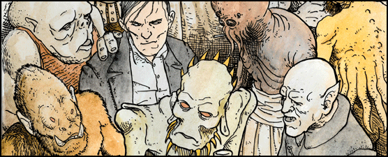
I just borrowed the second instalment of Moebius and Jodorowksy's The Incal featuring John Difool and the Metabaron, amongst others. I can't say I'm the biggest Jodorowsky fan so this left me a bit flat on the story side of things. The art on the other hand... looked crap. What!!! What did I just say 'Moebius crap??' Sadly yes, but it wasn't his fault. The copy I had is an English DC edition published in 2005 which features new colours by Valerie Beltran. Now I'm sure Beltran is a great colourist for her own work but for Moebius... Half of what is great about Moebius' work (alright maybe a third or a quatre) is his use of colour. Moebius' colour lets the line work breath, adds depth, and conveys emotion. Beltran's (in this particular book) is claustrophobic, homogenous and soulless. Moebius' work becomes generic and uninspiring.
I did a little google search and found a
site which shows original pages with the new ones, the contrast is striking. What else is funny is that the new work has been censored. Is it the comic code? are the Americans prudes? I haven't bothered to find out but the end result is disappointing and an inaccurate introduction to Moebius' work for the uninitiated.
Here are some examples.
Original
New.